Welcome to IEC’s New Brand & Website
Welcome to an exciting new chapter for IEC! We are eager to share with you our updated brand and website, which reflect our journey of growth over the past four years and into the future. As an organization dedicated to collaboration, our new look and content were driven by input from our community, including IEC’s staff, IDD self-advocates, Board members, and funders.
In our initial conversations, we learned that many of our partners best know the organization as “IEC,” rather than its full name – Institute for Exceptional Care. When asked to describe the organization, some common themes emerged; people say IEC is inclusive, dynamic, innovative, driven, and passionate. We leaned into this feedback to create IEC’s refreshed brand.
A Visual Representation of Collaboration + Healthcare
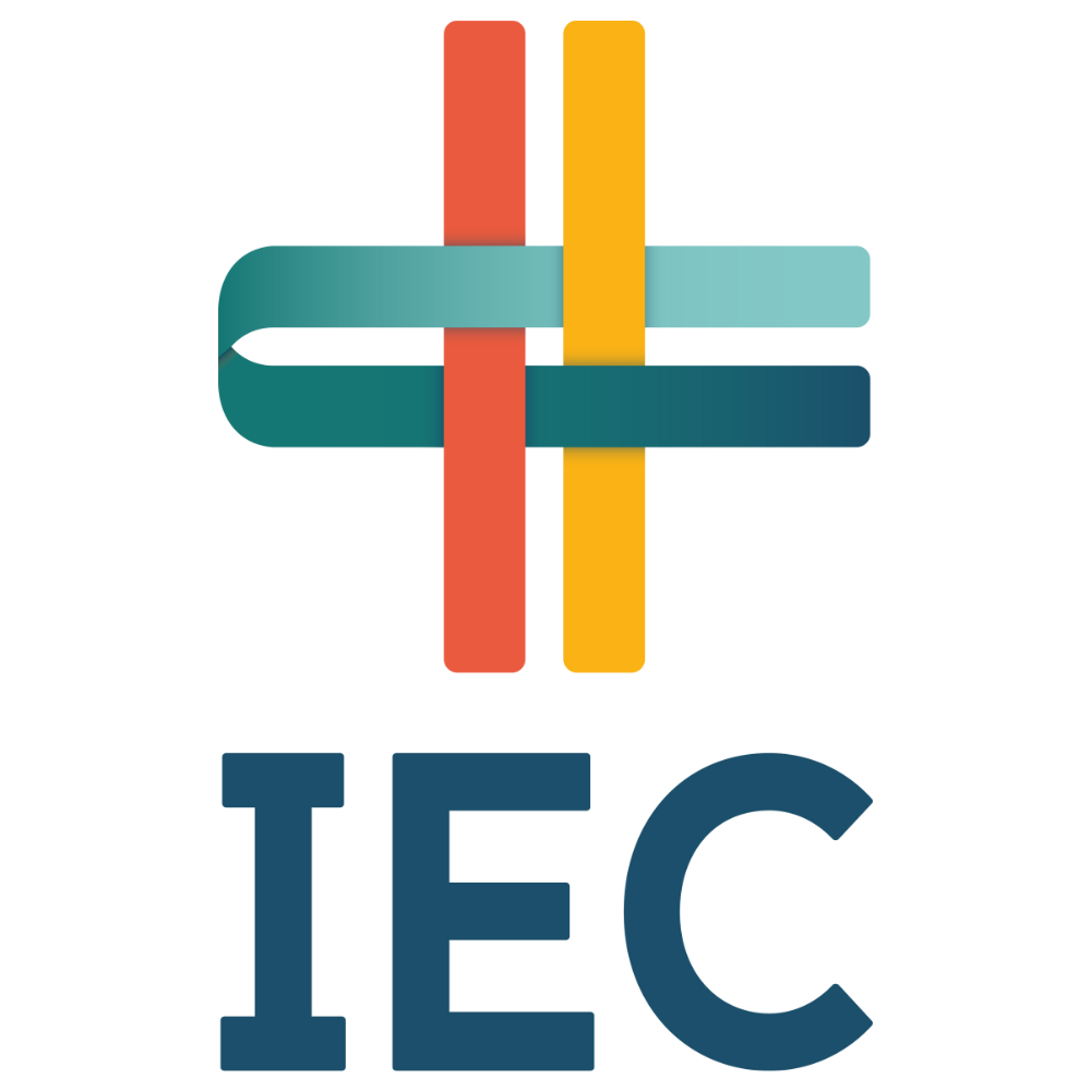
Our new logo is meant to reflect how IEC connects communities by integrating diverse perspectives into a unified whole, all in support of making healthcare better and safer for people with intellectual and/or developmental disabilities. As those different groups come together, they form a well-known medical symbol, portraying our clear connection to improving healthcare. We also see convergence as a “+ sign,” noting the positive or addition when partners collaborate. The looping gradient that changes from blue to green symbolizes that IEC changes healthcare from within – and throughout – the system. We’ve also included a nod to the disability pride flag by using “warm” colors (red and yellow) on one side of the logo and “cool” tones (green and blue) on the other side.
The main logo uses just the IEC letters, and we’ve paired the logo with accessible fonts. You’ll also notice many new vibrant colors, representing the dynamic and innovative nature of our work.
Our Refreshed Website
The most immediate place you will see this updated image is on our new website. We have worked to create a welcoming experience for all site users, both through new language and a refreshed design. The updated site highlights our unique model, our work, and the impact we’re making together.
We created the website with accessibility in mind, as well. You may notice:
- An accessibility tool at the bottom of your screen, which you can click to meet your needs for the best site experience.

- A Plain Language translation tool at the top of the navigation, which can change the website content with just one click. You will also find a second language translation tool at the bottom of your screen that includes other language options.


- Visual cues with illustrations of our work and icons that provide more context.
We invite you to explore our website and share with us your thoughts on how we can continue to showcase our work and connective nature. We are confident this new chapter will help IEC bring more people into the movement of making healthcare better and safer for people with IDD, and we welcome your perspective.